Sunday, August 26, 2012

Last assignment from the New York trip class. This one was a lot of fun, we got to illustrate a New York character that we had seen on our travels through the city. The Pride Parade happened to be on the day we arrived in New York, so I went to check it out. Needless to say, lots of colourful characters to be seen there! I was pretty amazed at some of the costumes people wore, very extravagant. 

I decided to continue the playing card theme with this illustration (I'm thinking of expanding these pieces into a series, possibly a whole deck, we'll see). This character is based on a photo I took at the Pride Parade. This individual struck a pose and had a lot of attitude in their pose, so I tried to capture that in my illustration. 

linocut and digital


Black and white print from the linocut I carved.
linocut print

Colored in Photoshop.
linocut and digital


Look who I spied in the parade!


Wednesday, August 15, 2012

scratchboard & digital
Most recent New York class assignment. For this illustration the theme was New York as a city. I decided to do the illustration as  a  playing card, which was fun. I'm continuing the playing card idea with my next assignment as well. Would like to extend it into a series, as I have a few ideas for characters for the cards.

The top half of the card shows the Statue of Liberty as it is today, with the green patina of the weathered copper. The background is based on a photo I took while in New York. The bottom half of the card shows Liberty under construction, with the original copper colour intact. The statue was constructed with an inner framework, and copper plates attached on top. The buildings in the background are based on a photo I found of Longacre Square (now Times Square) in 1900. I chose to make the card suit hearts to play off the "I love NYC" touristy t-shirts. 

I tried scratchboard instead of linocut for this one. Not sure what I think of it yet, but would like to experiment more with it. 


Pencil drawing for Liberty.

Scratchboard.
scratchboard

scratchboard

Scratchboard drawing after it's been cleaned up digitally.
scratchboard


scratchboard


Monday, July 30, 2012

This is a reaction illustration from the New York trip. For this assignment I decided to pick an article from Harper's magazine and illustrate it. The article I chose is called "Same-as-that" by Dale Peck.
Linocut and digital.

This is the first version I did. After getting feedback from my instructors, I created a linocut stamp so it was more consistent with the rest of the illustration.
Linocut and digital

Process! Below are the prints I used in my illustration. I created separate blocks and printed the images separately, then collaged them together in Photoshop. 
Linocut

Linocut

Linocut

Linocut

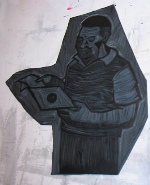
These are the lino blocks I created to print from.


Saturday, June 23, 2012

portfolio

Below is a selection of images I am taking with me on a school trip to New York. Should be an adventure!

Greeting card - Digital

Alphabet - Ink

Image based on the Japanese mythological creature Tengu. Linocut and water-colour.

Silkscreen print.

"Dogspeak" book. Silkscreen.

Etching.

Storyboard. Digital.

Hand-drawn alphabet project for Decorative illustration class. Had fun with this one. Some of the letters were really challenging to come up with! How many ways can I contort a bird...

ink


F

K

Z

Series of illustrations for a greeting card project. I chose to go with a seasonal theme that also included some nymph-like characters.


digital

digital

digital

digital

Spot illustrations from Decorative Illustration class. Based on selected chapters from Neil Gaiman's book Sabriel from the Abhorsen series (highly recommended read if you haven't read it). :)


ink and digital

ink and digital

linocut
endpaper pattern
detail of endpaper