Sunday, October 28, 2012

Some process work for current poster project. Five colour silkscreen print, plus there will be a relief layer with the text and a little logo. Still playing with the colours. I mixed a darker purple. Being very pernickety, but having a lot of fun with this. Went to school tonight to print, got all set up, went into the screen wash out area, discovered sinks full of water and pump overflowing. Awesome. So needless to say, got very little screen printing done. But I did proof my polymer plate and it surprisingly worked out. Pretty happy about that. 

Ah the joys of sharing a studio.  


silkscreen print
Five colours so far. This is a proof, so some of the colours I adjusted.

silkscreen print
This one I kinda like as is, even tho there is no background.

silkscreen print
First two layers of edition (red and yellow).

Friday, October 19, 2012

Sketches from life drawing last night. Thanks to Seth for lending me the water-colour graphite to try out. I think I found a new toy. Picked some up for myself at Opus today.


Some process work for my open studio class. What is it for? Stay tuned.

scratchboard

hmmm... after looking at this again, that umbrella needs to be re-worked. Looks weird.

scratchboard

scratchboard

Tuesday, October 02, 2012

First project from poster class! Movie poster for "Harold and Maude." Apparently Harold and Maude is some popular cult classic from the '70s. *shrugs shoulders*  I liked it, it was funny and quirky and awkward. 


silkscreen print (5 colour)

This is the first three layers. The fourth layer is a transparent light blue, which overtop of the blue, green and red creates the other colours.


Sunday, August 26, 2012

Last assignment from the New York trip class. This one was a lot of fun, we got to illustrate a New York character that we had seen on our travels through the city. The Pride Parade happened to be on the day we arrived in New York, so I went to check it out. Needless to say, lots of colourful characters to be seen there! I was pretty amazed at some of the costumes people wore, very extravagant. 

I decided to continue the playing card theme with this illustration (I'm thinking of expanding these pieces into a series, possibly a whole deck, we'll see). This character is based on a photo I took at the Pride Parade. This individual struck a pose and had a lot of attitude in their pose, so I tried to capture that in my illustration. 

linocut and digital


Black and white print from the linocut I carved.
linocut print

Colored in Photoshop.
linocut and digital


Look who I spied in the parade!


Wednesday, August 15, 2012

scratchboard & digital
Most recent New York class assignment. For this illustration the theme was New York as a city. I decided to do the illustration as  a  playing card, which was fun. I'm continuing the playing card idea with my next assignment as well. Would like to extend it into a series, as I have a few ideas for characters for the cards.

The top half of the card shows the Statue of Liberty as it is today, with the green patina of the weathered copper. The background is based on a photo I took while in New York. The bottom half of the card shows Liberty under construction, with the original copper colour intact. The statue was constructed with an inner framework, and copper plates attached on top. The buildings in the background are based on a photo I found of Longacre Square (now Times Square) in 1900. I chose to make the card suit hearts to play off the "I love NYC" touristy t-shirts. 

I tried scratchboard instead of linocut for this one. Not sure what I think of it yet, but would like to experiment more with it. 


Pencil drawing for Liberty.

Scratchboard.
scratchboard

scratchboard

Scratchboard drawing after it's been cleaned up digitally.
scratchboard


scratchboard


Monday, July 30, 2012

This is a reaction illustration from the New York trip. For this assignment I decided to pick an article from Harper's magazine and illustrate it. The article I chose is called "Same-as-that" by Dale Peck.
Linocut and digital.

This is the first version I did. After getting feedback from my instructors, I created a linocut stamp so it was more consistent with the rest of the illustration.
Linocut and digital

Process! Below are the prints I used in my illustration. I created separate blocks and printed the images separately, then collaged them together in Photoshop. 
Linocut

Linocut

Linocut

Linocut

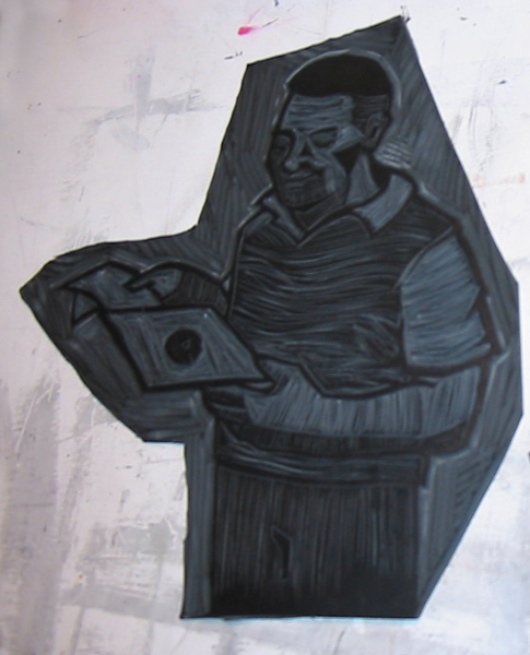
These are the lino blocks I created to print from.