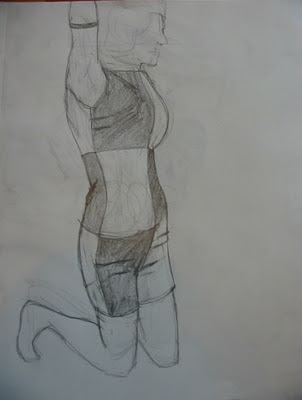
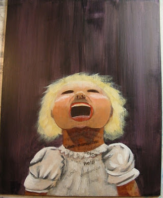
another design up at Threadless. :D
Thursday, December 15, 2011
Wednesday, December 14, 2011
Sunday, December 11, 2011
and then there were dinosaurs.
Final massive etching project that consumed all my time for the past two weeks. But it was worth it. :)
The project was to build an image, like we normally do. This was all done on the same plate, so this first image no longer exists. :(
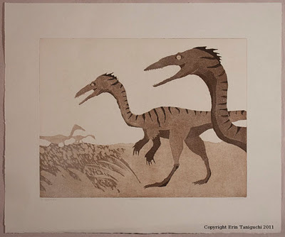
Second step was to destroy it. This was the fun part, because if whatever you were trying to do didn't work out, it didn't matter. The goal was to make a mess and obliterate your image. I could have done more obliterating, but I was running out of time. Stupid deadlines.
Third step was to take your destroyed plate and build up another image. I wasn't expecting so much of my original image to show through, so I just added to the image. I really like the layering effect though. Very cool. I also like how the dinosaurs look like they're fading away.
etching
Some process photos:
Working on the first step of building up an image. Slowly covering up more and more of the drawing as I put the plate in the acid bath so I get a variation of greys. In photo-language, the exposed copper gets more "burning" time. Print-language, it gets more etching time. For some reason when I'm in the etching part of the process, I think of it like a photo darkroom. Not sure why.
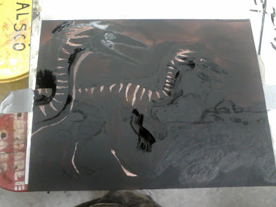
Inking and wiping the plate. This can be a physical process, depending how big the plate is. I'm sure my plate is tiny compared to "real world" plate sizes, but my arm was getting sore. Or maybe I'm a wimp.
All those dirty cloths you see at the top of the photo are what we use to wipe the ink off of the plate. This is one of the messier parts of the whole process.
Plate ready to print. The ink stays in all the little "grooves" that have been etched into the plate.
how iguanafish came to be.
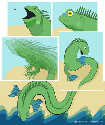
This is my final Digital Illustration project. A four panel storyboard of an existing story or one we made up. Mine is the latter, obviously. :)
Again, I wanted to find out more about this creature I drew, so I thought - origin story! Pretty simple little story, but it's my first sequential art since foundation year.
I've been having fun practicing inking in Illustrator. Getting to know the "width" tool a little better.
Tuesday, November 22, 2011
art on transit
This is one of my submissions for the Art on Transit program that Translink is doing. Translink is the Vancouver bus system. Character looks familiar, yes? I liked my initial drawing, and wanted to expand it and find out more about this creature. I tried a few different tails (shark tail, dolphin tail, etc.) but settled on more of a lizard-ish tail.

digital (Illustrator and little bit Photoshop)
Expanded pencil sketch/drawing.
Screen shots of in-process work. I initially jumped right into color, and then proceeded to confuse myself. So I went back to straight black and white to try to wrestle out the values.


In-process changing the greyscale to color.
Whole finished guy. Overall pretty happy with it.
Sunday, November 20, 2011
I Guan A Fish.
Aquatint etching project. Had fun with this one. :)
Aquatint is not really what I thought it was, but I like it because it introduces tone to the etching process. I thought it would be like a painterly or watery effect ("aqua"-tint). But nope, modern aquatint is spraying the copper plate with spray paint. Maybe I will look up the origins of "aquatint"... must have originally had something to do with water, right?
etching (aquatint & soft ground)
I remembered to take process pics this time. This is the copper plate part-way through the etching process. Aquatint is done at this point, but the background is blank.

Getting the plate ready to put into the acid bath. The background of the print is done with soft ground. I applied the ground, then put saran wrap on my plate and ran it thru the press, so the texture is imprinted into the ground. All the shiny lines that you see is the exposed copper. That is what will etch. The black-ish stuff covering the fish image is hard ground. All of the "grounds" are acid-resistant, so anything I covered with the hard ground (the fish) is protected from the acid when I put the plate in the acid bath. So only the background part of the plate will etch.
I don't know if any of that made sense. It's kinda hard to understand until you see a demonstration. I didn't even understand aquatint the first time around with a demo. :)
DECK.
It's that time of year again! DECK show time. :)
I'm a little late for promo-ing the opening (it was on saturday night), but if you are in Vancouver, you can check out the show (and possibly buy a board if you're so inclined).
DECK is on till January, so it's up for a while yet.
at The Fall gallery and tattooing: 644 Seymour Street.

Tuesday, November 08, 2011
vfs.
Went to the VFS life drawing on the weekend. Good times. The model was really good, but alas, the longest poses they did were five minutes. Too short for my slow drawing. But, we did warm-up (30 sec. poses) for at least 30 minutes, which was nice. I think I need that loosening up time. Need to remember to do that when I work on school projects....


All drawings done with pencil or graphite (woodless pencil).


All drawings done with pencil or graphite (woodless pencil).
Tuesday, November 01, 2011
package party.
Monday, October 31, 2011
Saturday, October 29, 2011
etching project.
This is our third etching project. This one we used soft ground. Soft ground is really, really, really sensitive - meaning if you accidently touch it or something brushes against it, the ground will lift off and get etched. So you can accidently etch your fingerprints, for example. I have a lot of background textures on this print that I didn't really want (like paper towel), but it looks cool anyway. I also used hard ground on this plate too (the smaller, thin-lined drawings around the edges of the print).
Soft ground is super fun tho. You can etch virtually anything. I started my plate by pressing shrimps (didn't really work) and dried fish into the ground. Kinda gross but fun at the same time. The fish textures came out really well, I was pleasantly surprised. The big shrimp was drawn onto the soft ground with a charcoal pencil. I love that you can get gestural line, and a wide variety of line with the soft ground.

fresh meat.
Typography project for Digital Illustration. I'm finding I'm enjoying this class; it's a combo of design and illustration. I'm starting to be OK with sitting in front of the computer for hours on end again. I think I needed that two-year break of virtually no computers being involved in my art-making process. With the exception of silkscreen - that involved a little bit of computers.
For this project I thought photography would be the best solution for my idea. I think it turned out pretty well, thanks to some photo help from a school friend. :) I especially like how the "H" turned out, it looks very organic.

Monday, October 17, 2011
snakes & ladders
Latest project for etching class. We had the theme "snakes and ladders". The first thing that comes to mind is obviously the board game, so I looked up the history of the game, and became quite interested in what I found. It originated as a Hindu game around the year 1200 AD, and sounded like it was used as a teaching tool to teach children how to live a good life. The snakes symbolized vices, and the ladders symbolized virtues; making one's way across the board symbolized life (in life you come across things that help you and hinder you). The game has a whole list of virtues and vices (interestingly the "vice" list is waaaay longer than the "virtue" list); I picked two - knowledge and murder.

etching (hard ground)
First time using the acid bath, kinda intimidating at first, but after the first dunk it was OK. First you apply a "ground" to the copper plate, then you draw on the ground, exposing the copper underneath. When you put the plate in the acid bath, the part of the plate that is exposed gets etched (the metal gets eaten at and grooves are formed in the plate).
etching & chine collé
I really enjoyed the chine collé. The process is kinda slow (well, printmaking in general is SLOW), I think that's why I like it so much. :) The chine collé is the application of japanese paper (or any kind of paper, we were shown with the japanese paper) to the print. I liked it because it's a way of adding color, but you're only printing with black ink.
Wednesday, October 05, 2011
rocktober
Latest Dr. Sketchy sketches. Theme was "rocktober", complete with live music! Live music, beer and sketching = good times.
This first sketch looks a little more like "anime-tober" than rocktober, but oh well. :)

itty bit of breathing space.
A tasting session of what I have been working on in september.
These first two are prints from my etching class. I had forgotten how messy and smelly the intaglio printing ink is. But I still like it. :) This is my first time using copper as a matrix. A good challenge.
These first two are prints from my etching class. I had forgotten how messy and smelly the intaglio printing ink is. But I still like it. :) This is my first time using copper as a matrix. A good challenge.
Monday, September 26, 2011
marvel ad
Some in-process work on my icons project for Digital Illustration. Should be finishing up these bad boys some time today, if all goes well. The theme for my icons is The Avengers, and the rest I hope is self explanatory. :)
All of these images are vector drawings (Illustrator). Can't wait to use the finished icons on my computer!

Sunday, September 25, 2011
painting sessions three and four
Subscribe to:
Posts (Atom)


