Friday, December 30, 2016
Rockwell Kent
Rockwell Kent is one of my favourite historical illustrators; here is a short bio on him.
Rockwell Kent was an American printmaker and illustrator born in 1882, and died in 1971. He was born in Tarrytown, New York. Kent studied with several painters, such as Arthur Wesley Dow and William Merritt Chase. He also studied at the New York School of Art. Kent painted in addition to his illustration work. He did a series of paintings from a trip to Alaska in 1918; producing a memoir titled "Wilderness." He is well known for his illustrations of Moby Dick, published in 1930. Moby Dick contains black and white pen and ink drawings by Kent. It was very successful and sold out; Random House produced a trade edition. Kent illustrated many books over his career, including Beowulf, Leaves of Grass by Walt Whitman, and Faust by Goethe. He also designed murals, including one for the United States Post Office in Washington, DC. Kent worked in woodcut and lithography, as well as pen and ink. His drawings have a graphic look to them with large bold areas of black. He uses repeated small marks to describe backgrounds. Kent's signature style uses high contrasts of black and white.
Source: https://en.wikipedia.org/wiki/Rockwell_Kent
Friday, December 16, 2016
Friday, December 09, 2016
Dr Sketchy drawings
Here are some life drawings I did at Dr Sketchy this past month. The ones shown are longer poses - 10 to 15 minutes.
Friday, December 02, 2016
Helpful Books Part II
I've been busy this week working on some magazine illustrations for Broken Pencil. I can't share them yet, but they turned out pretty well. Here is another post on helpful books for art and creativity.
Breakthrough! Overcome Creative Block and Spark Your Imagination
This book is a collection of thoughts from many different professionals on ideas to overcome creative block. It includes writing from graphic designers, artists, illustrators, writers, creative directors, musicians, and photographers. Every artist experiences creative block, and this book is a fun read through a diverse array of solutions.
Show Your Work!
by Austin Kleon
This book is a fun look at the art of promotion. Austin gives simple, do-able ideas on how to get your work out there for the world to see. He talks about showing your process, sharing one thing everyday, and the importance of sticking it out and being persistent in your career. He also discusses how to take criticism, a very useful skill when one is an artist.
It's Not How Good You Are, It's How Good You Want to Be
by Paul Arden
The first part of this book discusses mindset, ambition and success.The second part focusses on the process of graphic design, coming up with ideas, dealing with clients. Paul simplifies ideas and makes the solutions clear and concise. He gives direct advice and makes it understandable.
Work / Life
This is a book by Uppercase, the design magazine headed by Janine Vangool. Work Life features 100 illustrators from around the world, showing their work and their process. Each artist has a short write up, accompanied by their visual solution to a custom assignment given to them.
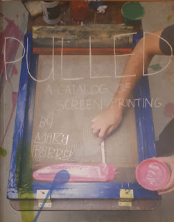
Pulled
by Mike Perry
Pulled is a collection of silkscreen artists and their work. It includes groups such as Seripop, and individual artists. A great book to have for inspiration.
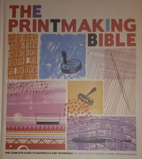
The Printmaking Bible
by Ann D'arcy and Hebe Vernon-Morris
This is a hefty book, and delves into the different types of printmaking. It is very educational and goes through the processes for each printmaking method. Included are intaglio, relief, lithography, screen printing, and monotype. The book features step by step instructions for each method, as well as different artists and their work. It also goes into the history of each method.
Breakthrough! Overcome Creative Block and Spark Your Imagination
This book is a collection of thoughts from many different professionals on ideas to overcome creative block. It includes writing from graphic designers, artists, illustrators, writers, creative directors, musicians, and photographers. Every artist experiences creative block, and this book is a fun read through a diverse array of solutions.
Show Your Work!
by Austin Kleon
This book is a fun look at the art of promotion. Austin gives simple, do-able ideas on how to get your work out there for the world to see. He talks about showing your process, sharing one thing everyday, and the importance of sticking it out and being persistent in your career. He also discusses how to take criticism, a very useful skill when one is an artist.
It's Not How Good You Are, It's How Good You Want to Be
by Paul Arden
The first part of this book discusses mindset, ambition and success.The second part focusses on the process of graphic design, coming up with ideas, dealing with clients. Paul simplifies ideas and makes the solutions clear and concise. He gives direct advice and makes it understandable.
Work / Life
This is a book by Uppercase, the design magazine headed by Janine Vangool. Work Life features 100 illustrators from around the world, showing their work and their process. Each artist has a short write up, accompanied by their visual solution to a custom assignment given to them.

by Mike Perry
Pulled is a collection of silkscreen artists and their work. It includes groups such as Seripop, and individual artists. A great book to have for inspiration.

The Printmaking Bible
by Ann D'arcy and Hebe Vernon-Morris
This is a hefty book, and delves into the different types of printmaking. It is very educational and goes through the processes for each printmaking method. Included are intaglio, relief, lithography, screen printing, and monotype. The book features step by step instructions for each method, as well as different artists and their work. It also goes into the history of each method.
Friday, November 25, 2016
East Side Culture Crawl
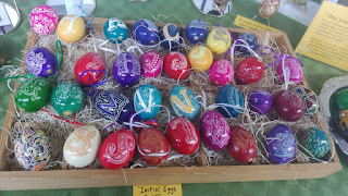
Last weekend I took in the Culture Crawl, an artistic festival that opens up studios and lets people into the artist's space. Spread out over the east side of Vancouver, I focussed on the Clark Drive area (close to Commerical). Many different mediums are represented - paintings, photography, wood work, glass, pottery, sculpture and textiles. Here are some photos I took at the festival.
Glass hearts by Laura Burns
Painted alarm bells by Christina Norberg
http://www.christinanorberg.com/
Painting by Jon Shaw
http://jonshawpaintings.com/
Pottery by Jinny Whitehead
http://jinnywhitehead.com/
Pottery by Shawn Mccord
Initial eggs by Jacquie Rolston
http://jacquiedraws.com/
Glass hearts by Laura Burns
Painted alarm bells by Christina Norberg
http://www.christinanorberg.com/
Painting by Jon Shaw
http://jonshawpaintings.com/
Pottery by Jinny Whitehead
http://jinnywhitehead.com/
Pottery by Shawn Mccord
Initial eggs by Jacquie Rolston
http://jacquiedraws.com/
Friday, November 18, 2016
Helpful books Part I
I thought I would share some books that I have found helpful and inspirational for illustration and business. Going through my books I found more than I thought I would, so will probably break this up into two posts.
Nuts & Bolts
This is a book by Charles Hively, the art director behind 3x3 magazine (an illustration magazine). It is a collection of illustration advice from speeches he gave at universities. It is very direct and gives short to the point advice for emerging illustrators. He talks about illustration as a business, websites, and being visible as an illustrator. I picked Nuts & Bolts up in New York, so am not sure if it is available in Canada.
Art Inc.
This book is by artist and illustrator Lisa Congdon, and talks about building your career as an artist. It is a compact guide for artists wishing to grow their business. She discusses different paths you can take, for example galleries or exhibitions, and also illustration and licensing your work. She goes through the nitty gritty of promoting yourself and treating your art as a business. Lisa also talks about managing success, and different options when you get really busy. She also includes profiles of different artists.
How to be an Illustrator
by Darrel Rees
This book goes a little more in depth to how to operate your illustration business. He talks about portfolios, looking for your first job, how to go about producing your first job, finances, promotion. He also discusses the pros and cons of working from home, or renting a studio. Darrel also talks about agents, and the pros and cons. He includes interviews with professional illustrators, such as Sam Weber and Yuko Shimizu.
Handbook of Pricing and Ethical Guidelines
This is the Graphic Artists Guild Handbook, and is an extremely thorough look at the graphic arts and illustration industries. It covers legal rights, professional and technology issues, business practices, contracts. It goes in depth into graphic design, web design, and illustration and discusses each industry. It also has lists of pricing standards for each industry. This is the section I find most useful, and use it for quoting jobs. For example it will list price ranges for editorial illustration for full page, half page, spot illustrations. This book also includes samples of contracts, so you can use it for drafting your own contract.
Children's Writers and Illustrators Market
This books talks about the publishing industry, and how to go about submitting your work. The majority of the book is a list of publishers and their contact info. The list includes book publishers, magazines, and agents. Information on how to submit work is included with each listing. There is also a list of conferences and workshops.
The Handmade Marketplace
by Kari Chapin
This book is about the craft and handmade industry. It talks about branding, business practices, marketing. It also talks about blogging and social media. There are also sections on craft fairs, online stores, and getting into brick and mortar stores.
Friday, November 11, 2016
October in the Chair
This is a self promo illustration I did this week. I decided to do a portrait of a character in a short story. The story is "October in the Chair" from Neil Gaiman's collection Fragile Things. In the story the months of the year gather around a fire to tell stories. This is a tradition that they do, and the leader in the chair rotates. This time it is October's turn.
This is the description of October from the book:
"His beard was all colors, a grove of trees in autumn. Deep brown and fire orange and wine red, an untrimmed tangle across the lower half of his face. His cheeks were apple red" - Neil Gaiman
This is the description of October from the book:
"His beard was all colors, a grove of trees in autumn. Deep brown and fire orange and wine red, an untrimmed tangle across the lower half of his face. His cheeks were apple red" - Neil Gaiman
Friday, November 04, 2016
thank you!
Thanks to everyone that came out to my show this past month. Lots of people came to the opening, and I sold five pieces, so that was exciting. I think all in all it went pretty well, and was a good experience. Now I know how much work goes into preparing for a show.
Here is a brief post about the logo design process, similar to the illustration process I posted about earlier.
Logo Design Process
1. Brief - First step is to collect the information you need from the client. I do this with a questionnaire that I send to my clients. Things like what their business is, target audience, colours they want used, any ideas they may have. You can also get them to do a mood board, which is a collection of images, typefaces, and colours they like. This helps you get an idea of what is in their head.
2. Next step is thumbnails. From the information you have gathered, you create fast, small sketches to explore ideas.
3. After thumbnails you select your best ideas and create larger sketches known as roughs. In this stage it is best to work in black and white first, and add colour later. A well-designed logo works in black and white.
4. Feedback - You send the roughs to the client and they pick the one they like best, or give you changes to make.
5. Final - Once a sketch is approved, you create the final logo design. I usually send a variety of files to the client: high-res files for print, low-res files for web, and a vector file which can be sized to any size.
Friday, October 28, 2016
How to overcome creative block
I find I come up with ideas best when I'm not actively working on the problem. Or that is when ideas come to me. The key is to start sketching and brainstorm any ideas you have, good or bad. Once you have some initial ideas down, if you get stuck it can be helpful to step away from your work. Go for a walk. The different environment may jog your brain. I find I get a lot of ideas when I am walking. I don't know if it is the movement that helps.
Another thing I do is work in coffee shops when I am in the concept stage of a project. This puts me in more of a work mode, as I am out of the house. I go to my local coffee shop and work there for a few hours. I find I am more productive when I do this. I also keep a notepad by my bed to jot down any ideas. Sometimes when I stop actively working on a concept and let my brain relax (such as before bed) ideas will come into my brain. Usually this only happens if I have already started working on the project. My brain continues working subconsciously on the project.
Having a relaxing bath or shower also helps as it lets your brain relax and subconsciously come up with ideas. Basically I find my best ideas happen when I am not working. My process is work, relax, jot down ideas, continue working. I also find sleeping on ideas helps, as my brain works on the problem while I am sleeping, and in the morning I have new ideas.
Friday, October 21, 2016
Logo design
This is a logo design I finished working on recently. It is for a scrapbook / rehabilitation company. The client wanted a banner-type logo with just text. I had fun playing around with brush lettering and hand lettering, to give it a creative feel. I especially like how "scrapbook" turned out.
Friday, October 14, 2016
Design fundamentals
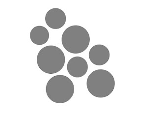
A fellow student (or instructor?) once commented to me that design is a bunch of CRAP: Cropping, Repetition, Alignment and Proximity. I heard that many years ago, and it still sticks because it is quite clever. Here are some of the things designers need to be aware of.
Cropping is how your image is framed (what part of the photo you can see).
Repetition is elements being copied numerous times.
Alignment is how the different elements in your design line up with each other.
Proximity is the sense of distance between objects.
There are many other things a designer has to consider.
Balance - symmetrical or a-symmetrical
Symmetry - elements on both sides are arranged similarly
Scale/Proportion - elements of differing sizes in relationship with each other
Similarity and Contrast - Contrast with a clear foreground and background shows a focal point.
Reference: monkeybusiness.com.br
Cropping is how your image is framed (what part of the photo you can see).

Alignment is how the different elements in your design line up with each other.
Proximity is the sense of distance between objects.
There are many other things a designer has to consider.
Balance - symmetrical or a-symmetrical
Symmetry - elements on both sides are arranged similarly
A-Symmetrical - elements on each side are different but still visually balanced
Hierarchy - the arrangement of elements in order of importance. For example, different weights applied to show hierarchy.
Scale/Proportion - elements of differing sizes in relationship with each other
Similarity and Contrast - Contrast with a clear foreground and background shows a focal point.
Reference: monkeybusiness.com.br
Friday, October 07, 2016
Psychology of Typefaces
A serif font has small lines attached to the end strokes in the letter. A sans serif font does not have these small lines.
Serif - tradition, respectable, reliable, comfort
Sans serif - stability, clean, modern
Script - elegance, creativity, affectionate

Display - unique, expressive, amusing
Fonts can also affect your sense of taste.Sans serif - plain, neutral
Slab serif - meaty
Round - sweet
Jagged - salty, sour
Reference: companyfolders.com, brandongaille.com
Friday, September 30, 2016
The Hanged Man Tarot card
The Hanged Man appears upside-down to represent turning his life around. Seeing things differently than those around him. He comes after the Justice card and has applied the truth of that card. He is attached to the tree of his spiritual values.
Just a reminder that my art show opens this coming Tuesday October 4th at 7pm at The Wallflower (Broadway and Main).
Just a reminder that my art show opens this coming Tuesday October 4th at 7pm at The Wallflower (Broadway and Main).
Friday, September 23, 2016
Psychology of Color
Each colour evokes a certain meaning or emotion. It is important to pick the right colours for your brand, depending on what you want your brand to communicate.
Green - fresh, environmentally-friendly, positivity. Green is a calming colour.
Blue - dependability, loyalty, peaceful. Also associated with calmness.
Purple - creativity, royalty, spirituality. Purple is associated with luxury and royalty.
Yellow - energetic, positivity, warmth, joyful, sunny. Yellow is associated with happiness.
Orange - energy, friendly, positive, playful. Orange represents high energy.
Red - love, passion, strength, powerful, dynamic. Red is also known to stimulate appetite.
Pink - feminine, soft, delicate, compassion
Gray - sleek, neutral, modern, calm, conservative
Black - power, elegance, authority, bold, sophisticated, classic
White - peace, purity
Brown - nature, woodiness, neutral
References: sprucerd.com, c4bmedia.com
Green - fresh, environmentally-friendly, positivity. Green is a calming colour.
Blue - dependability, loyalty, peaceful. Also associated with calmness.
Purple - creativity, royalty, spirituality. Purple is associated with luxury and royalty.
Yellow - energetic, positivity, warmth, joyful, sunny. Yellow is associated with happiness.
Orange - energy, friendly, positive, playful. Orange represents high energy.
Red - love, passion, strength, powerful, dynamic. Red is also known to stimulate appetite.
Pink - feminine, soft, delicate, compassion
Gray - sleek, neutral, modern, calm, conservative
Black - power, elegance, authority, bold, sophisticated, classic
Brown - nature, woodiness, neutral
References: sprucerd.com, c4bmedia.com
Subscribe to:
Posts (Atom)


